The control panel
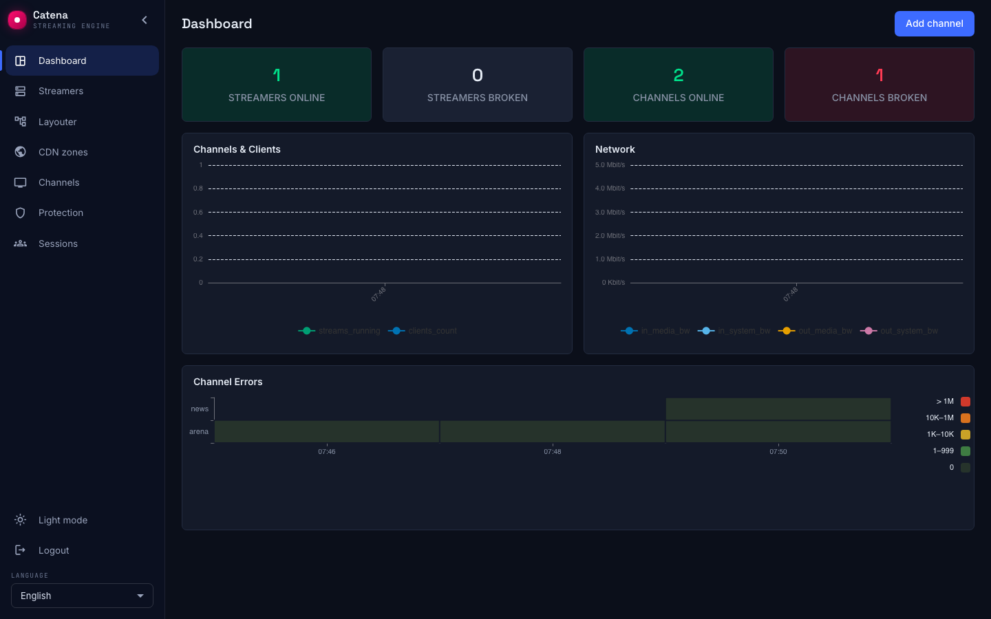
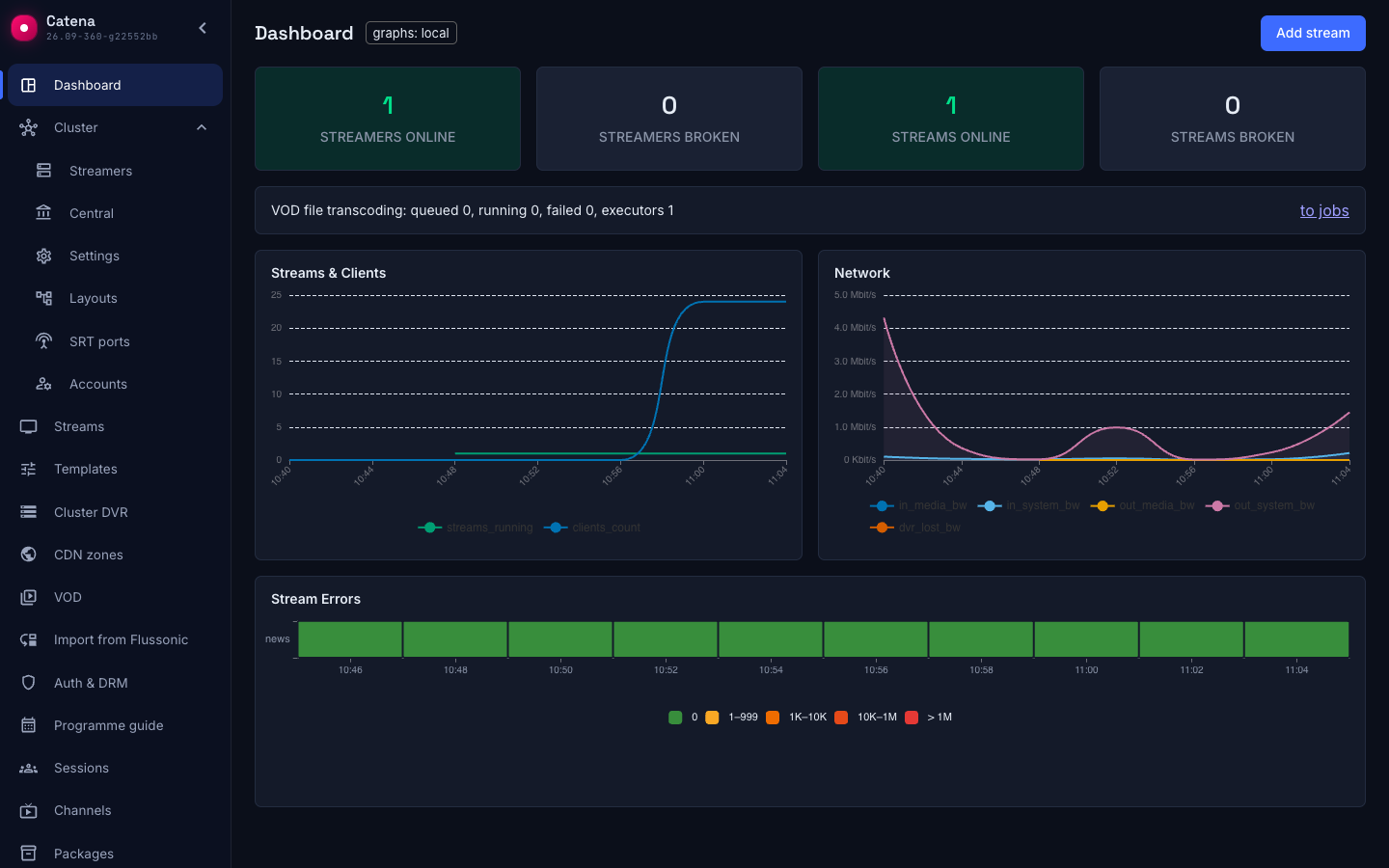
The first screen after login answers one question: is everything all right. Five tiles — the health counters; below them, the viewers and traffic dynamics; at the bottom, the per-stream error heatmap.
The tiles
- Streamers online and Streamers broken — the registry's summary: who reports, who stopped.
- Streams online — the streams that need no intervention: they are running, or idle by their own settings, like an on-demand stream without a viewer.
- Streams broken — the streams in error: an input error, an assignment not created, a streamer offline, or a rejected configuration.
- Streams without data — the streams the streamers send no data about: the layouter has not run yet, the assigned streamers have not reported, another central instance has just taken over the statistics.
- VOD file transcoding — how many transcoding jobs are queued, running and failed, and how many streamers can execute them. The row is there as long as central reports the registry summary.
Waiting streams belong to no tile: the state is transient, and once the input timeout runs out it turns into an error by itself. Disabled streams belong to none either. The indicator's values are explained in the stream list.
The broken-tiles stay gray while the count is zero and turn red on the first failure — on a healthy installation this screen is gray-green, and any red spot on it means work.
The Add stream button leads to the stream list.
The charts
- Streams and clients — how many streams are on air and how many viewers watch, over time. The streams are split by status in the same colours as the indicator in the stream list.
- Network — the installation's ingress and egress traffic.
The charts' history comes from the built-in metrics store: a fresh installation starts with empty axes, and the history accumulates as it runs.
The viewers on the Streams and clients chart are every play session of the streamers, not the stream viewers alone: someone watching a file from the VOD catalog counts the same as a live viewer. A rising viewers line while the stream count stays put is VOD viewers; the same number, per streamer, stands in the Viewers column of the asset card.
Stream errors
The heatmap at the bottom — a stream per row, time across; the darker the cell, the more errors fell on the stream in that interval. Hover a cell and the tooltip names the exact number. It is the fastest way to see that a stream is sick periodically: an even row of dark cells on one stream is a systematic source problem, a single spot is a one-off.
When something is red
- Streamers broken. Open the streamer registry: who exactly went silent and for how long — the reachability chips and the last sync live there too.
- Streams broken. Click the tile: the stream list opens filtered by error. Look at the source chain in the stream's row. A red dot — open the Sources tab of the stream page and work through the source with source diagnostics. Dots in order — open the stream page, press the button in the banner and work through the reason on the Layout tab with Placement status.
- Streams without data. Click the tile: the same list opens filtered by unknown. Wait a minute. The number did not shrink — check the runs on the Layouter screen and the configuration delivery in the registry.